

Imgur | Mobile Registration
Imgur is a social entertainment platform with more than 60 billion page views a month across web and mobile.
Background
Almost immediately after the successful launch of the creation flow, we realized the need for an updated registration experience. Users need to be registered and logged in to post publicly on Imgur, and we were losing new users mid registration flow. This also paired nicely with a growth goal of increasing new user registration. Although registration isn’t the most glamorous project, I was determined to create a seamless, easy, short registration flow that maybe, just maybe, could be… dare I say, fun.
Goal
Increase new user registration on mobile by 2x with a 3 week timeline
Results
Increased new user registration on mobile by 400%
My Role
Lead designer working with a PM
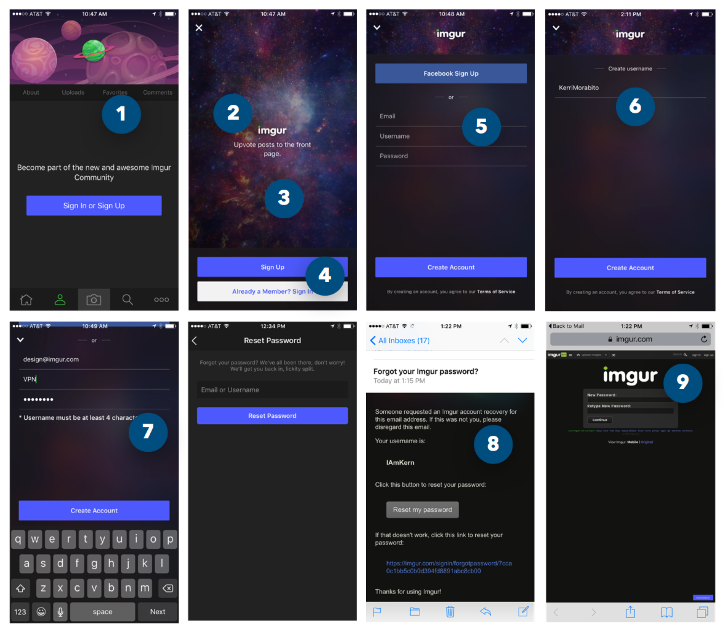
Identify the Problems
To really figure out where users were getting stuck and abandoning registration I went through and attempted to register, on both iOS and Android. I went through every possible route for registration, including the forgot password flow. I took screenshots of my journeys, laid all the screens out, and identified what our biggest blockers were.
Sketch Session
Since we were on a shortened timeline, I did a walkthrough of these screens with the PM so he could take notes and help make some bigger product decisions. We took our findings into a sketch session that included myself, the Head of Design, the project PM and VP Product. In the end we aligned on some product wants to help move the process along.
Ideate & Wireframe
Since I sketched with the team and aligned on product wants, I was able to move quickly into wireframes and visual iteration. In parallel I worked on the new user, existing user, and password reset flow.
The Gradient
I wanted to keep the visuals to a minimum for registration, since the goal was to get users through quickly and seamlessly. Although registration was a fairly utile task, I also didn't want it to feel completely boring and lifeless - utile can also be delightful, right?
I started with our core brand colors - grays, black, white - all of which left a very unfinished feeling, like my wire frames were implemented. I even tried flooding the background with our core brand green color - but that was entirely too much green. Finally, it hit me. I could use our secondary brand palette to create a gradient that would not only be visually appealing, but could act as a form of pagination, moving with the user through the flow. It was crazy enough to work!
Prototypes
Prototyping was key in creating the experience. I wanted to make sure I had all pieces consider, that everything flowed nicely, and that the story could be fully told when presenting the final iteration to the Product and Leadership teams for sign off to be built. It was very unlike anything we had built before, but I wanted the show them that we can have beautiful interactions, we can have color, we can have a great user experience, and it still feel very much like our brand.